Selected projects examined in detail — the position, the thinking, and how it was built out.
The Brief
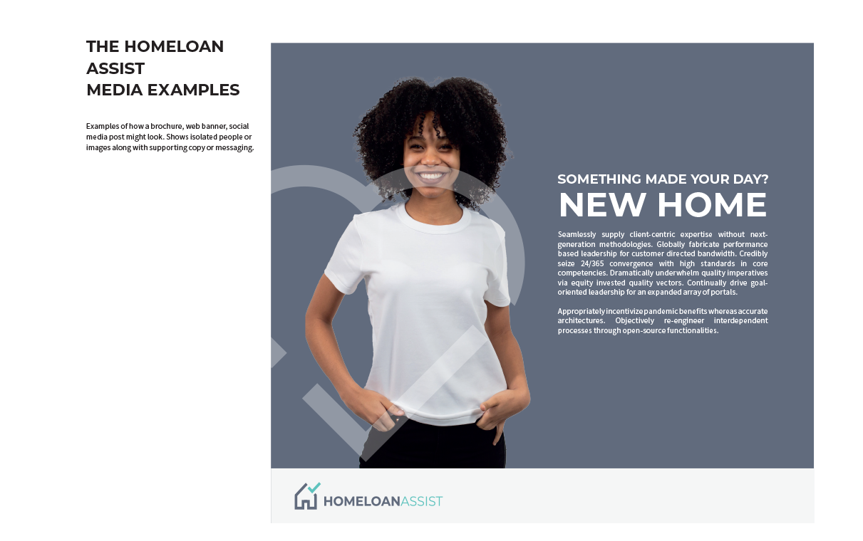
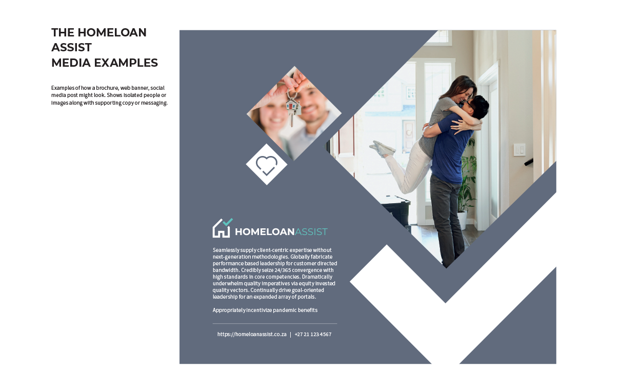
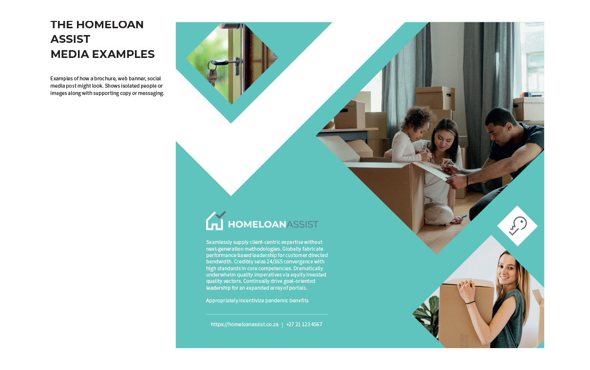
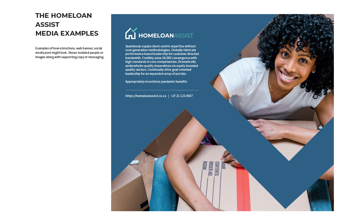
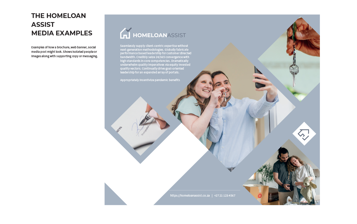
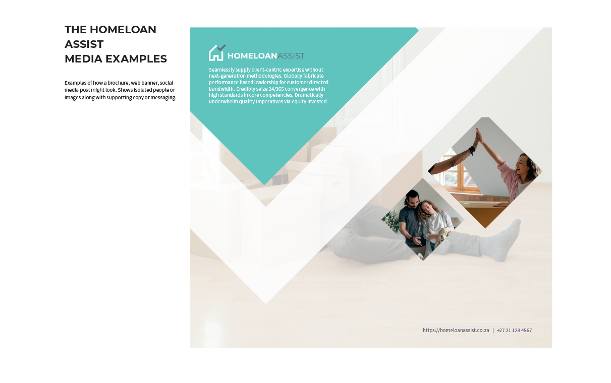
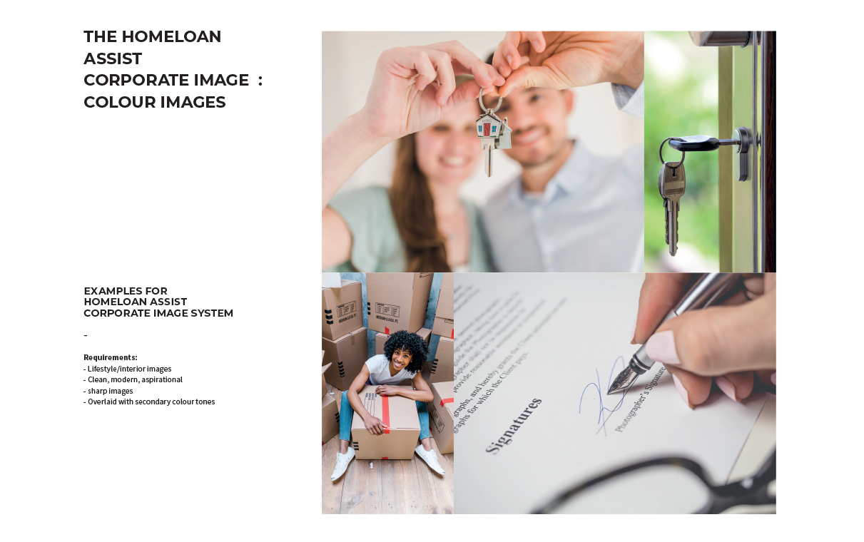
Ooba — South Africa's largest bond originator — was launching Homeloan Assist, a new digital product aimed at first-time home buyers. The product had no existing visual identity, no established position, and I was brought in to build one from the ground up before the launch date.
The Approach
Before any logo work started, I worked out what the product needed to stand for against Ooba's other offerings and its competitors — trust, accessibility, momentum for a nervous first-time buyer. That position drove an intensive mark exploration, then extended into a complete visual system: a warm, confident colour palette, a paired typeface stack, an icon set, and a full set of application templates.
The Outcome
A complete brand system delivered on schedule — logo suite with clear-space rules, a brand guidelines document, business card and letterhead templates, email signature, and social media assets. The position has since held up as the brand extended into digital marketing campaigns and in-app UI.
11
Deliverables
Logo suite, brand manual, stationery, social templates, and application assets.
1
Brand from Scratch
Full identity developed from a blank canvas — no existing assets or guidelines to work from.
On time
Delivered to Brief
All assets delivered before the product launch date, with revision rounds built into the schedule.
Next case study
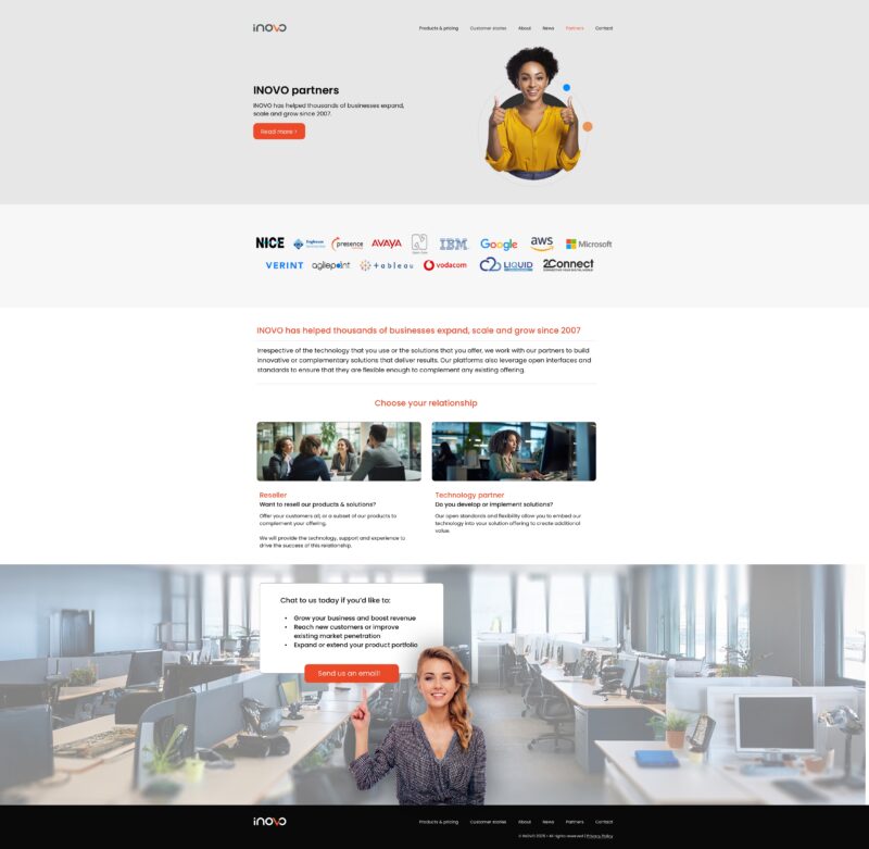
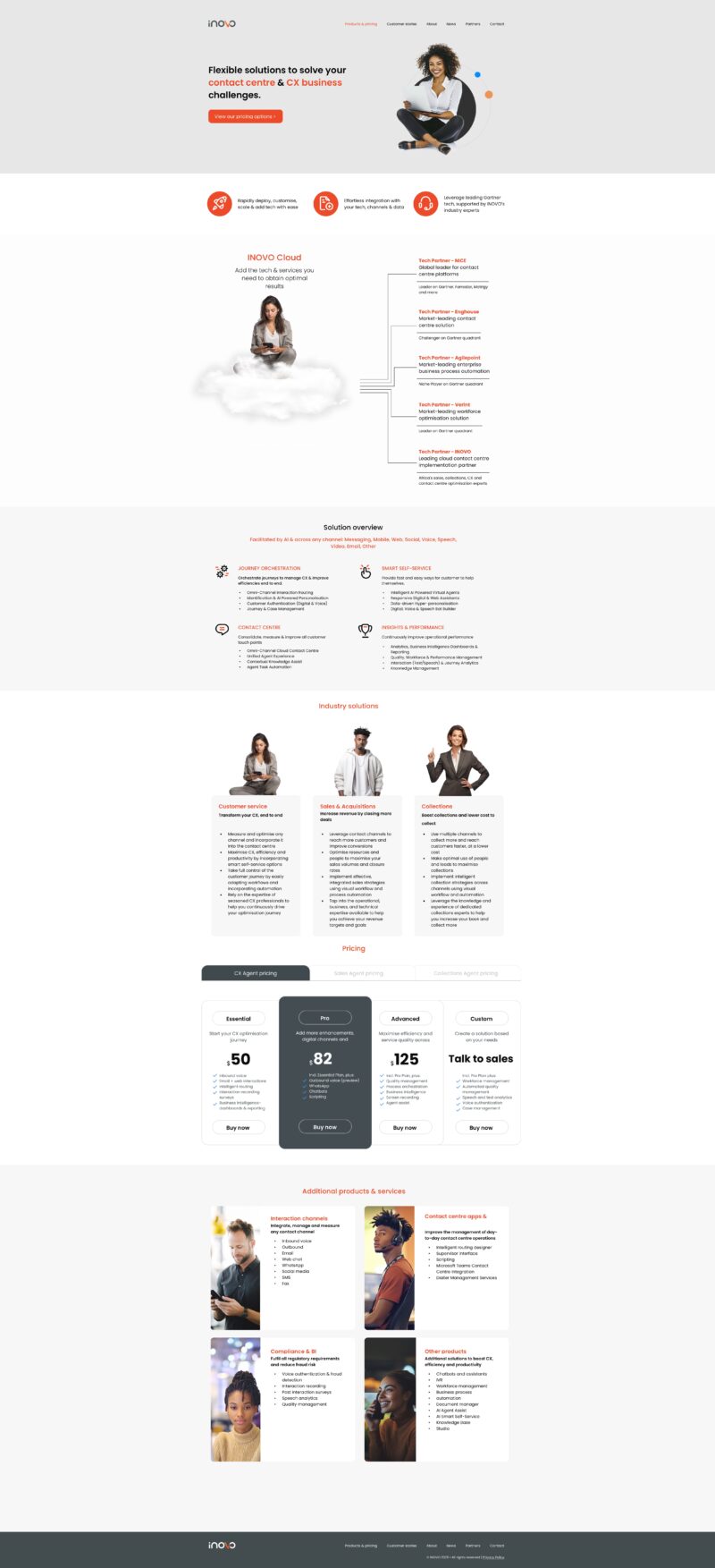
iNOVO Website 2025The Brief

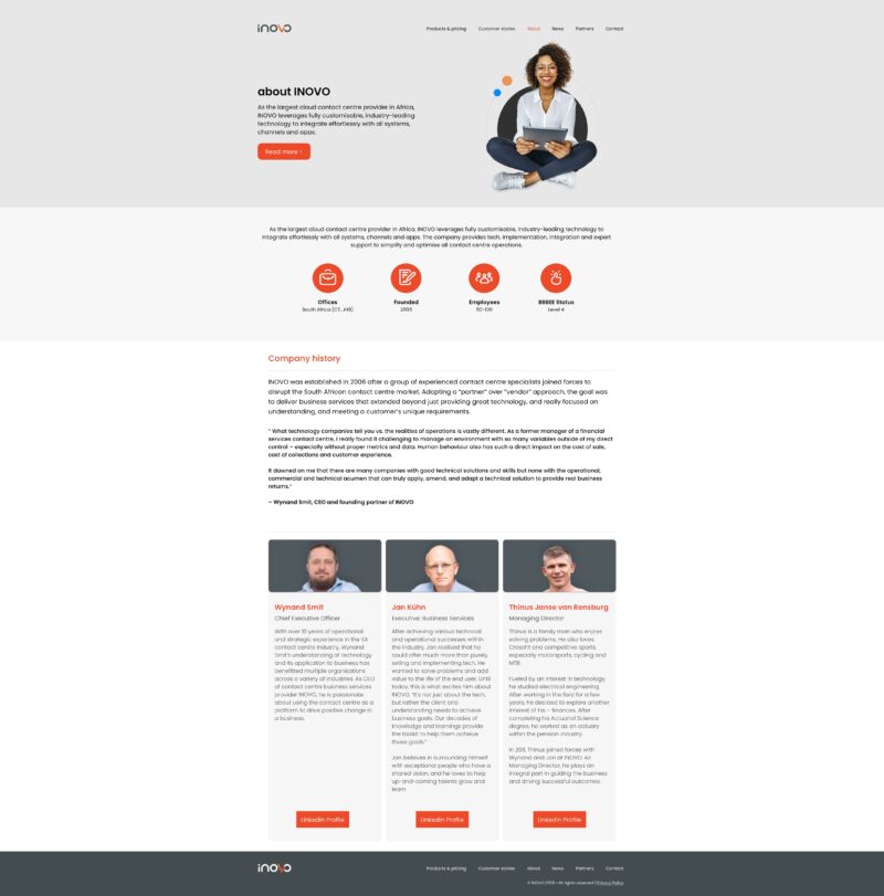
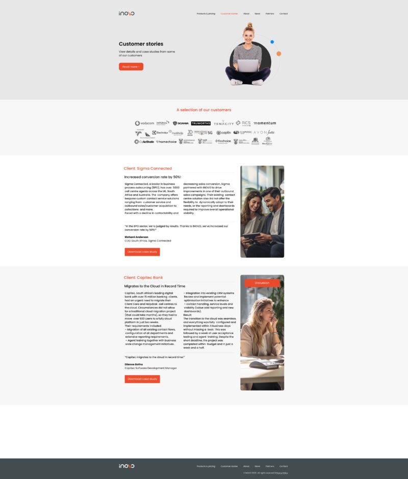
iNOVO is a South African contact-centre technology company with a growing international footprint. As the sole senior creative owning the brand, the brief was mine to set: replace an ageing website with something cleaner, faster, and more scalable — a design that could carry the position forward without needing to be rebuilt every two years.
The Approach
Working in Figma, I began with a thorough audit of the existing site and a review of the contact-centre technology space. The new design is built on a strict typographic grid, a restrained two-tone palette, and a modular component system — designed so the position stays consistent as any developer picks up the files.
The Outcome
Six fully resolved page layouts — home, about, customer stories, news, partners, and products — all production-ready for developer handoff. The layouts are responsive and tested across breakpoints, with a clean visual language that scales comfortably from mobile to widescreen.
6
Page Layouts
Home, About, Customer Stories, News, Partners, and Products — each fully resolved.
100%
Figma Delivery
Production-ready components with auto-layout, structured for seamless developer handoff.
All
Breakpoints Covered
Desktop, tablet, and mobile layouts — responsive from 320px to 1440px+.
Next case study
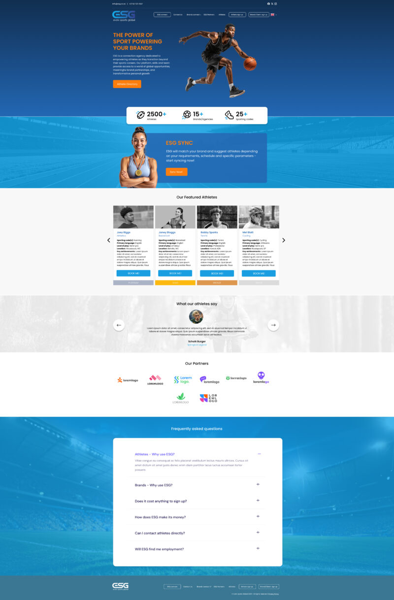
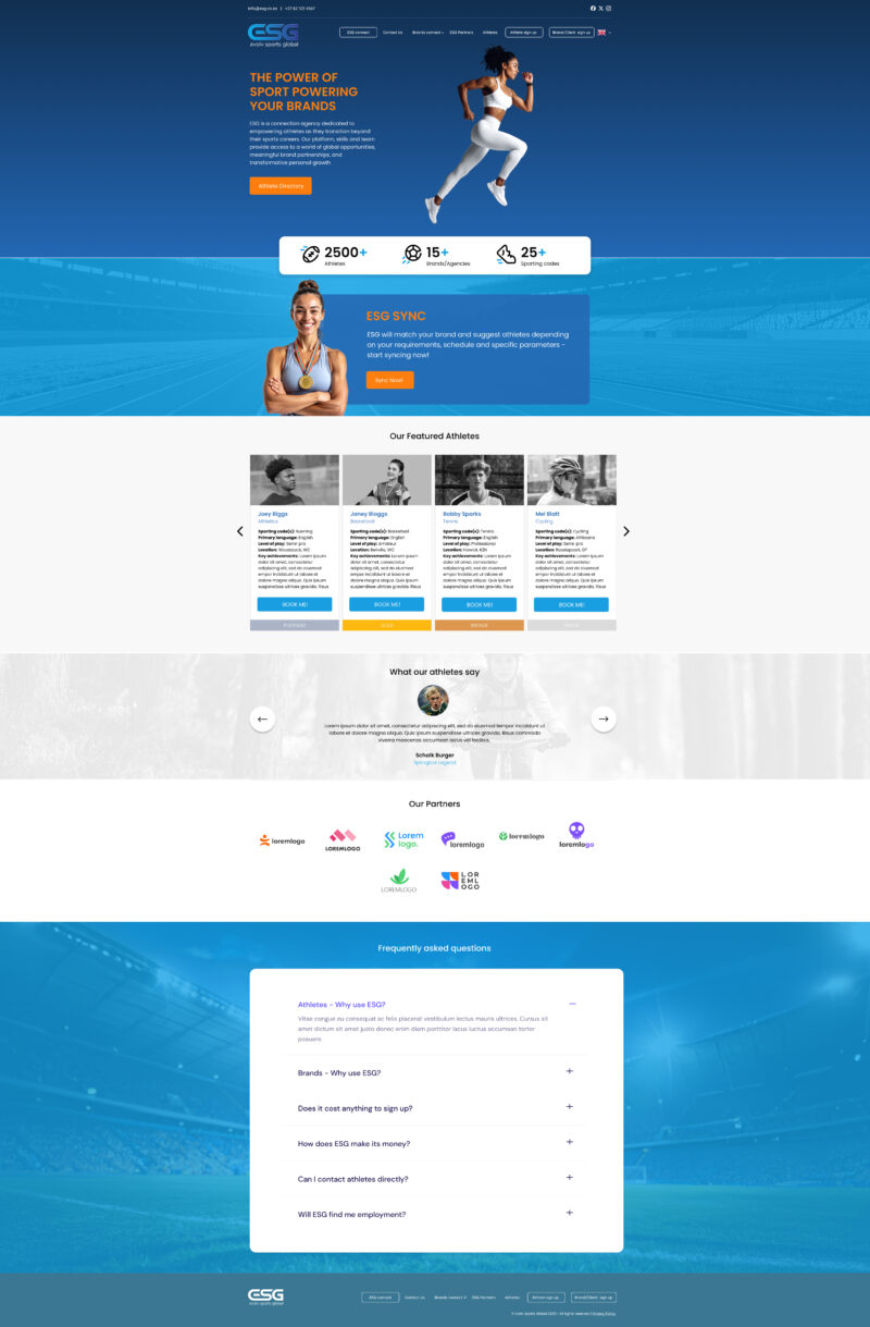
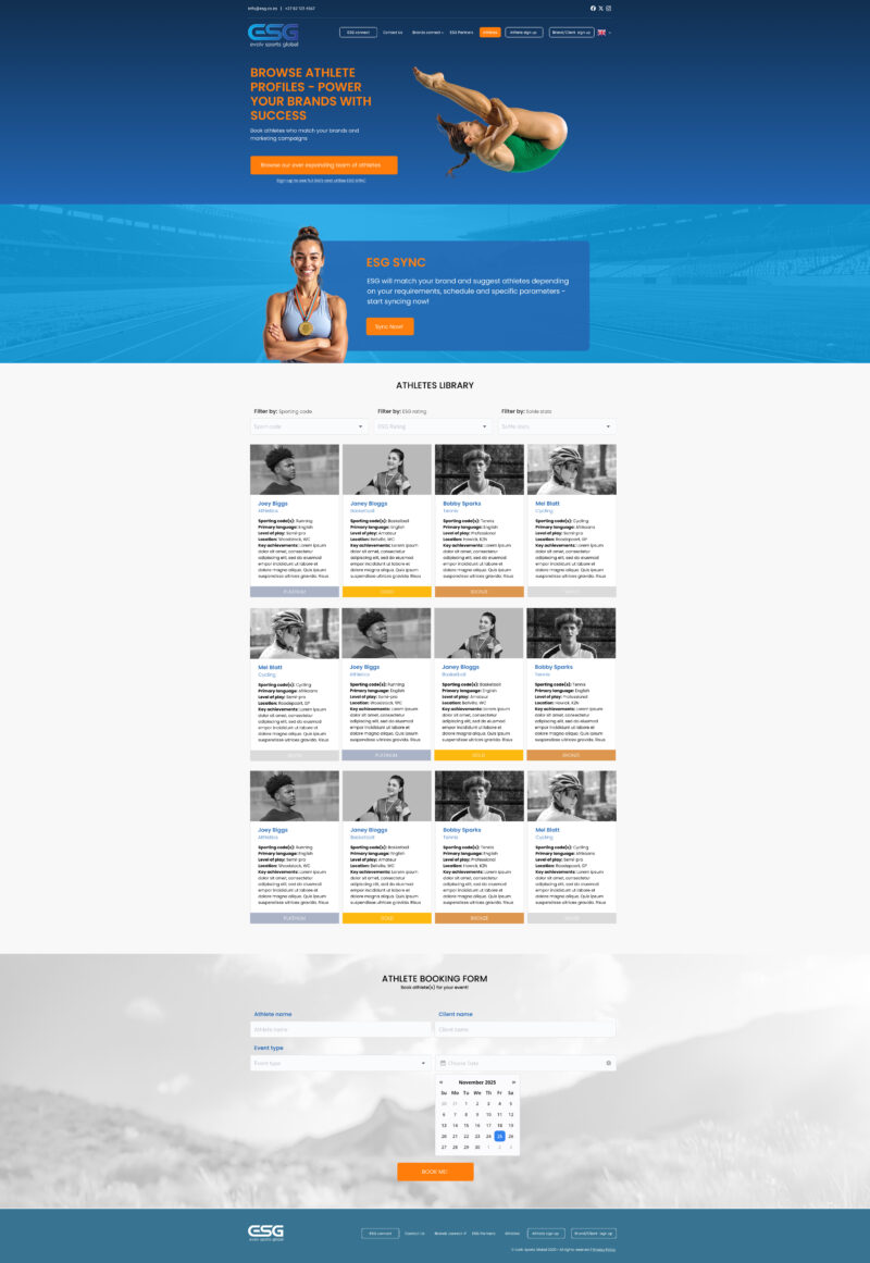
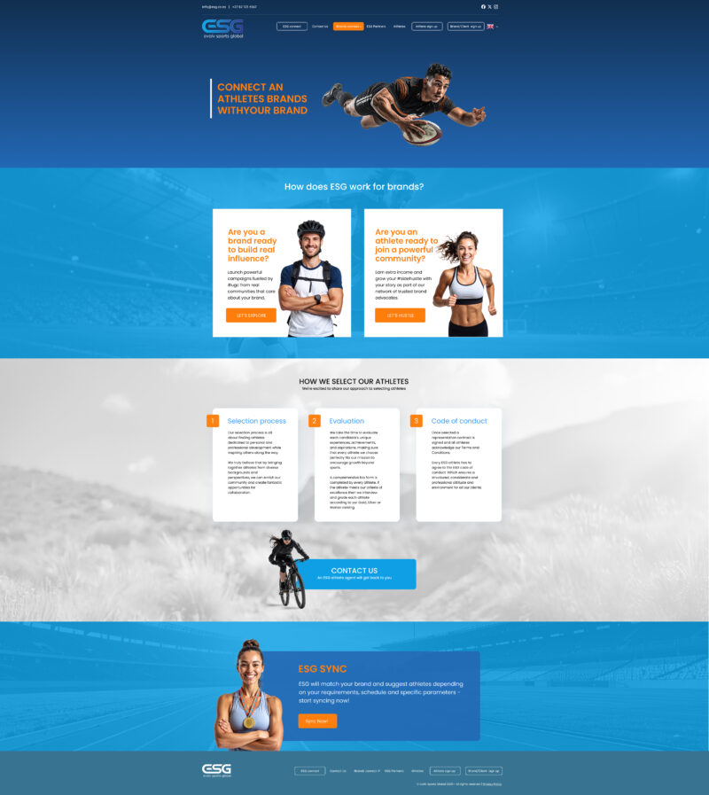
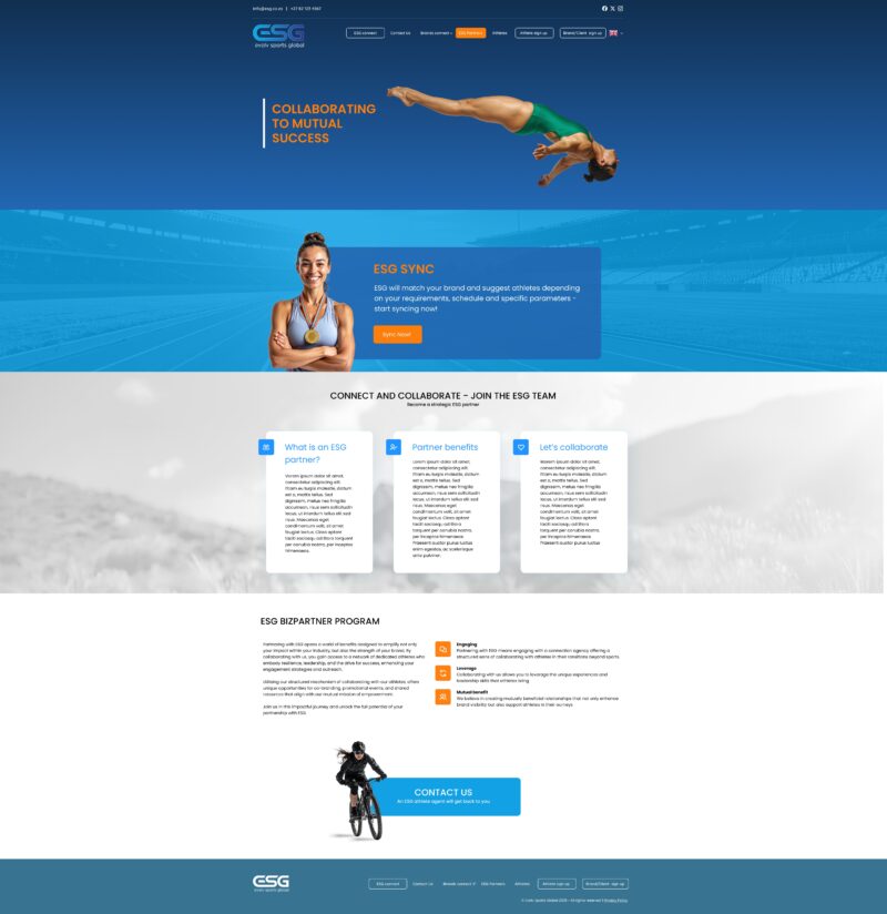
Evolv Sports GlobalThe Brief
Evolv Sports Global is a South African sports branding and athlete management agency with international reach. The brief was to design a modern, high-energy website that could be built in WordPress by a third-party developer — one that would confidently represent the brand to corporate sponsors, partner brands, and the athletes themselves.
The Approach
I worked closely with Shayne Dowling at ESG and Dave Moller at Paysoft, the WordPress developer. All designs were produced in Figma. The layout architecture was built for handoff — reusable section templates, clear typographic hierarchy, and a bold visual language that matched the brand's sporting energy without making the WordPress build overly complex.
The Outcome
Seven fully resolved page layouts — three homepage concept options, Athletes, Brands Connect, Partners, and Contact — delivered as annotated Figma files. The design was handed off to the development team and built out in WordPress, going live on schedule.
7
Page Layouts
Home (3 concepts), Athletes, Brands Connect, Partners, and Contact — all production-ready.
Figma
to WordPress
Annotated handoff files designed specifically to support a clean WordPress implementation.
Live
Delivered on Schedule
Designed, handed off, built, and launched on time in close collaboration with the dev team.
Next case study
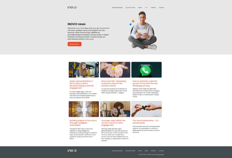
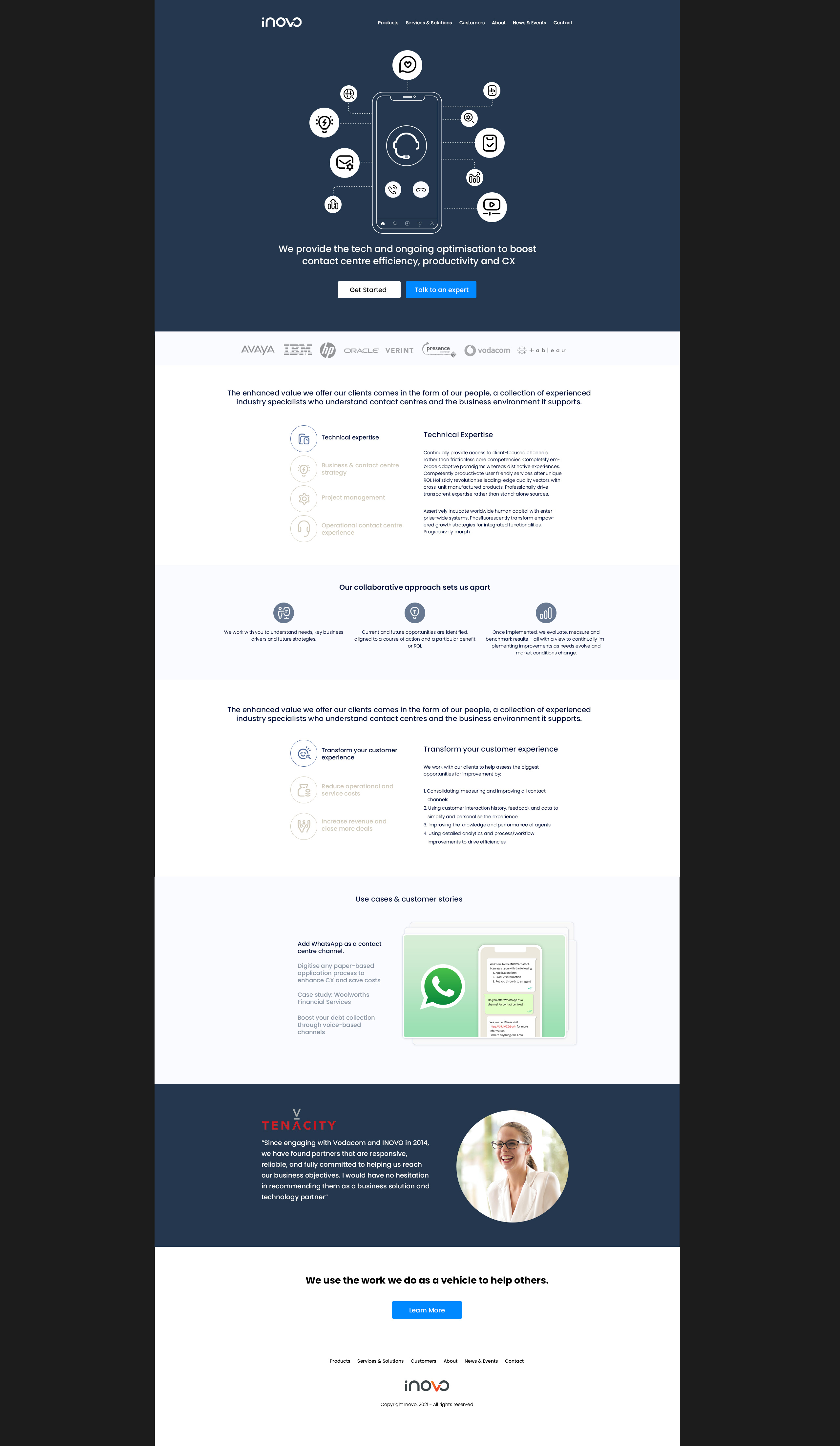
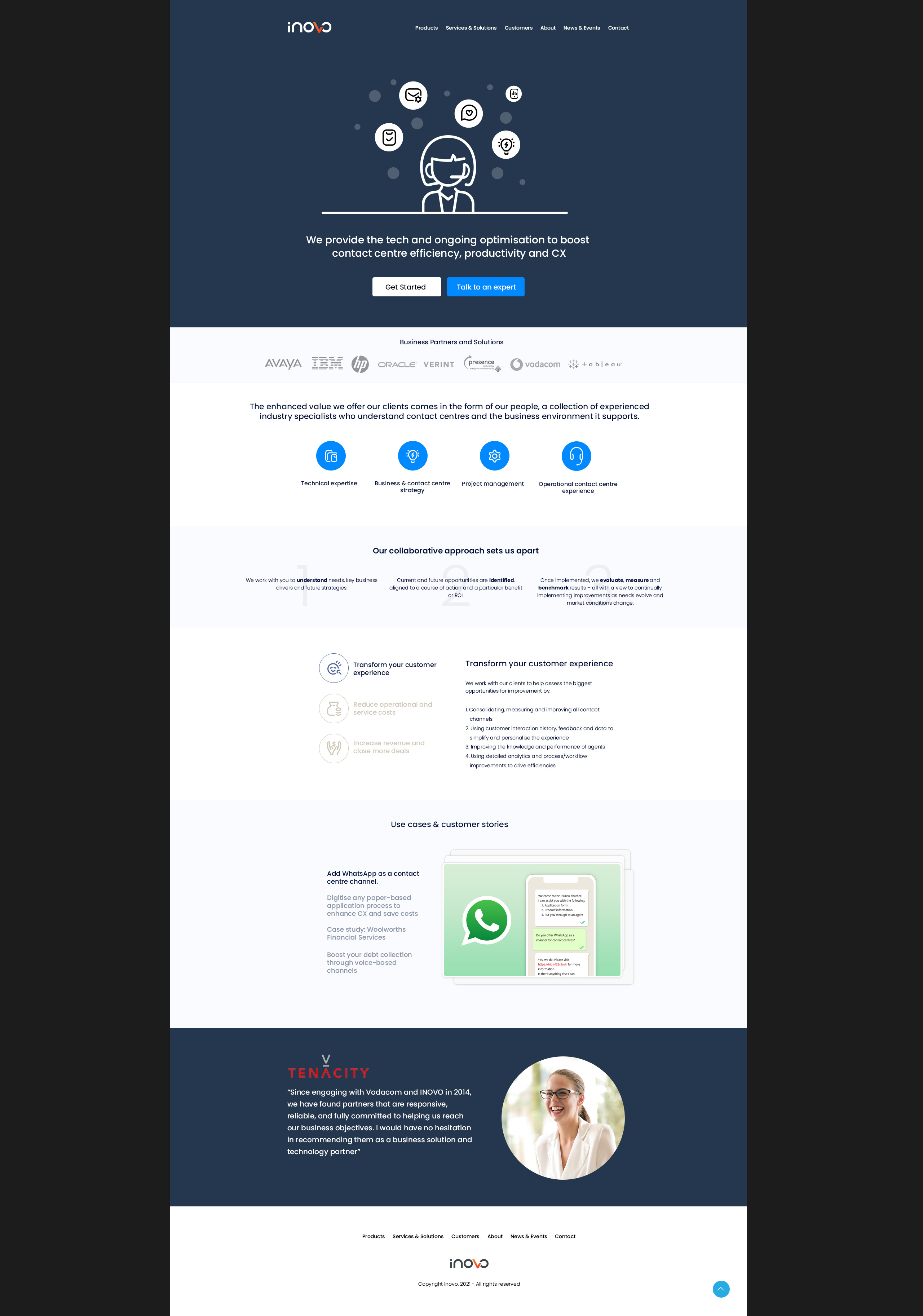
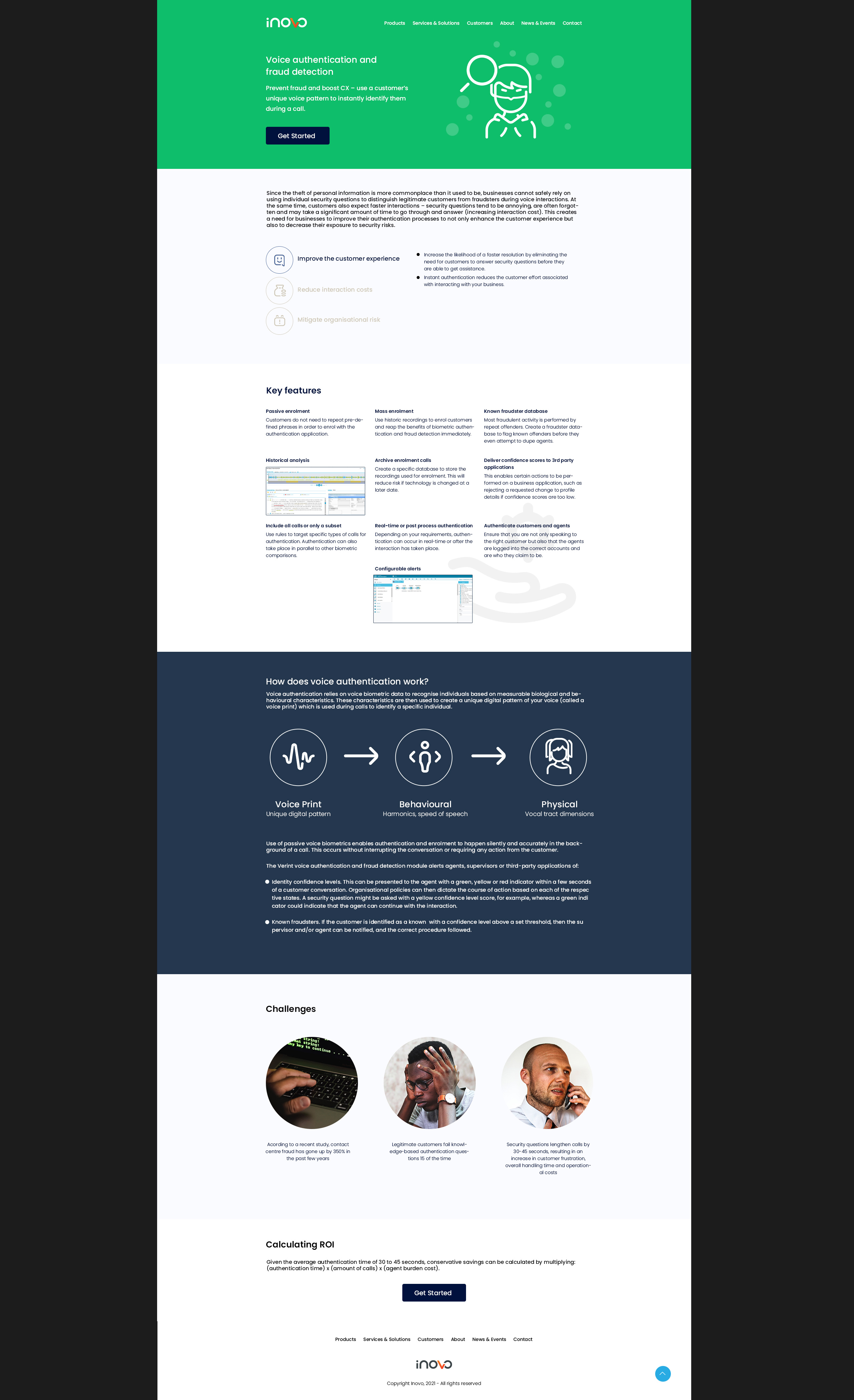
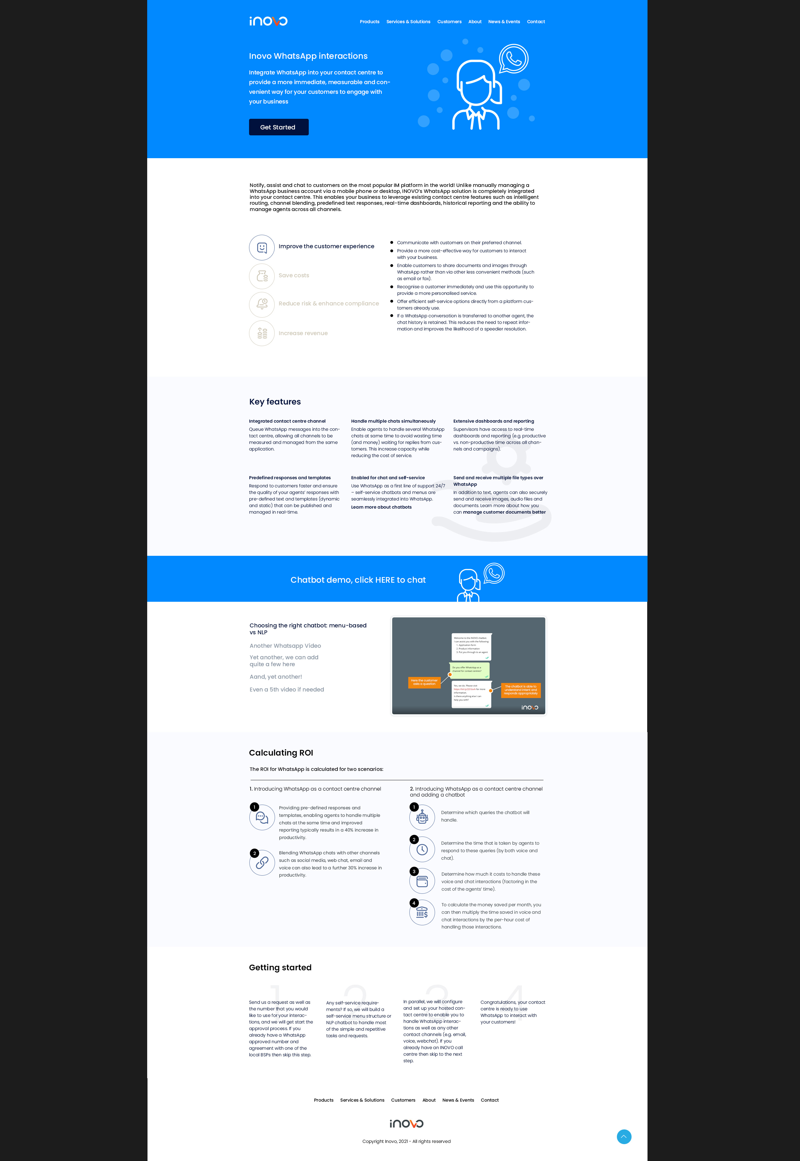
iNOVO Website 2021The Brief
iNOVO needed to modernise their web presence. The brief called for a cleaner, more structured website — one that communicated the company's technology offering clearly and confidently, with a disciplined visual language that felt fresh without straying too far from the established brand.
The Approach
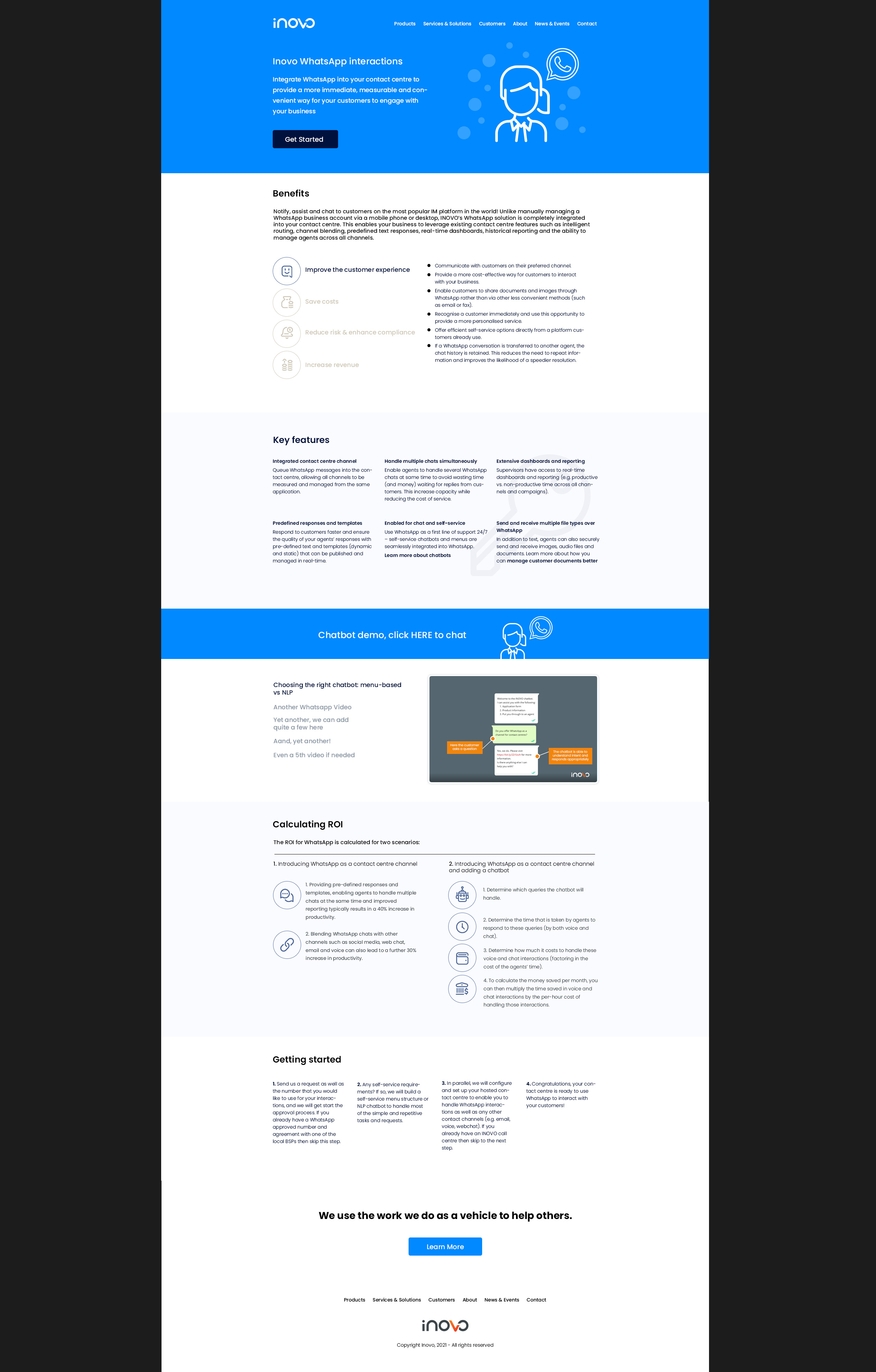
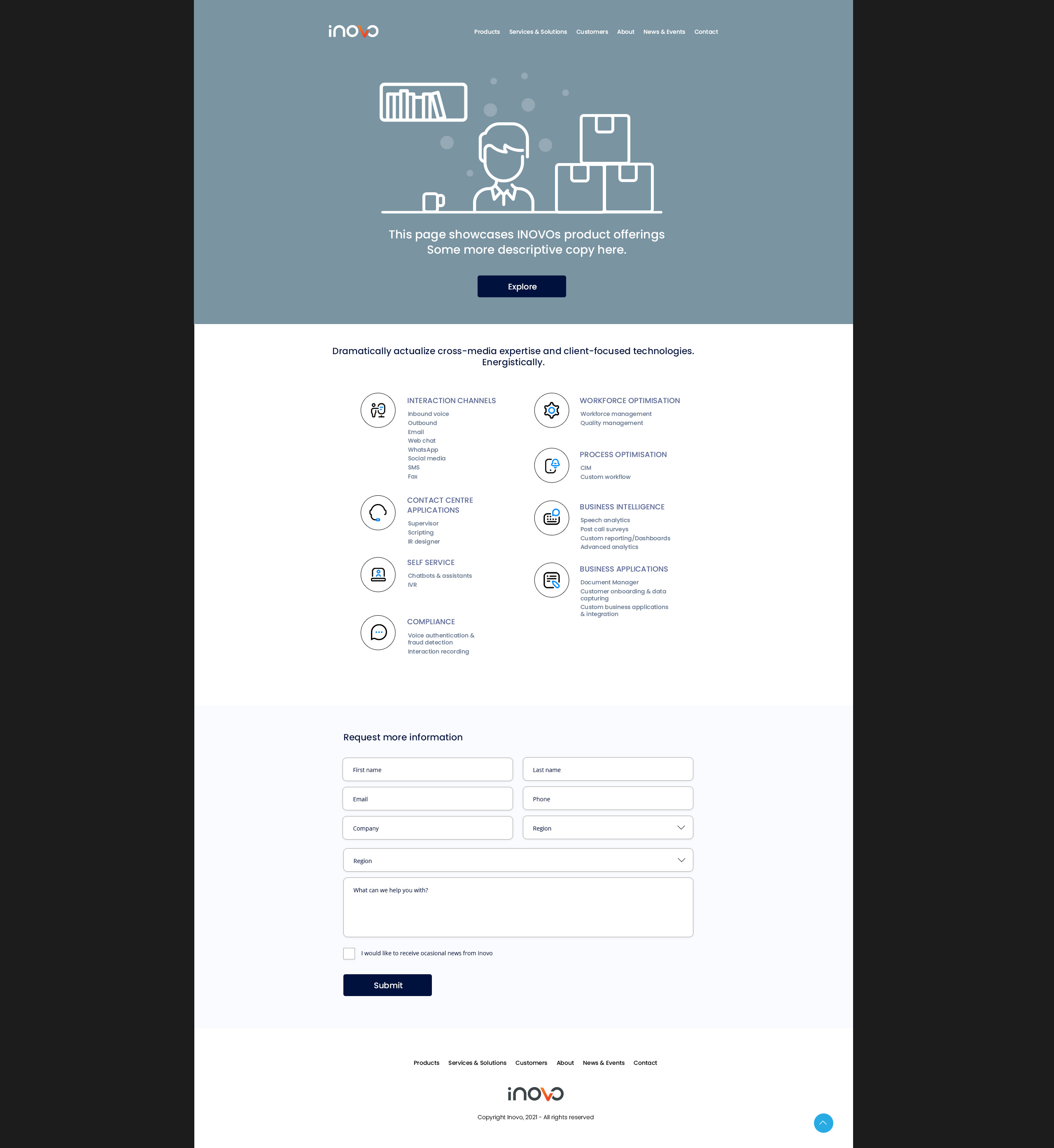
Multiple homepage concept directions were explored before arriving at a largely monochromatic approach with a single bold emphasis colour. This restraint gave the design clarity and let the product content breathe. Key pages covered included homepage variants, product listings, and feature-specific screens for technologies like voice authentication and WhatsApp integration.
The Outcome
A comprehensive set of resolved page layouts used as the direct foundation for the 2021 website revamp. The mono + one colour system proved scalable across page types — from high-level marketing overviews to detailed product and feature pages — and was handed off ready for development.
5+
Homepage Concepts
Multiple layout directions explored and refined before landing on the final design system.
Mono + 1
Colour Strategy
A disciplined monochromatic palette with a single emphasis colour — clear hierarchy, no noise.
Full
Site Revamp
All core pages redesigned — home, products, and feature-specific screens — delivered dev-ready.
Next case study
Shumani Mills IllustrationThe Brief
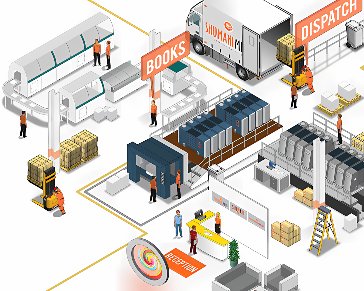
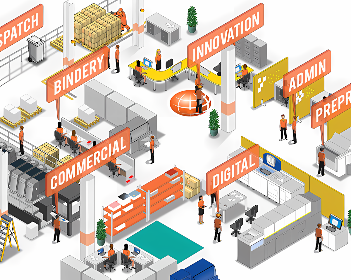
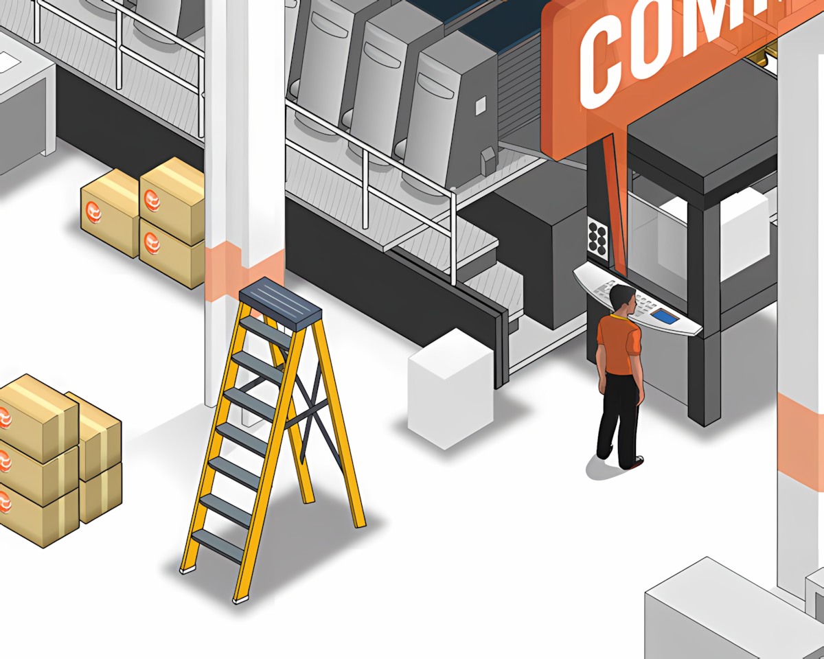
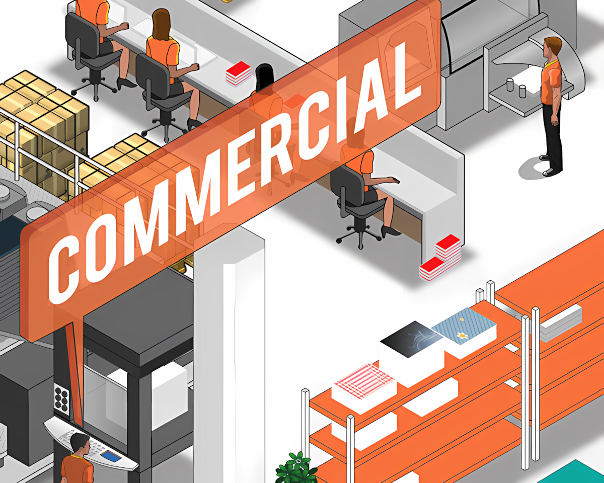
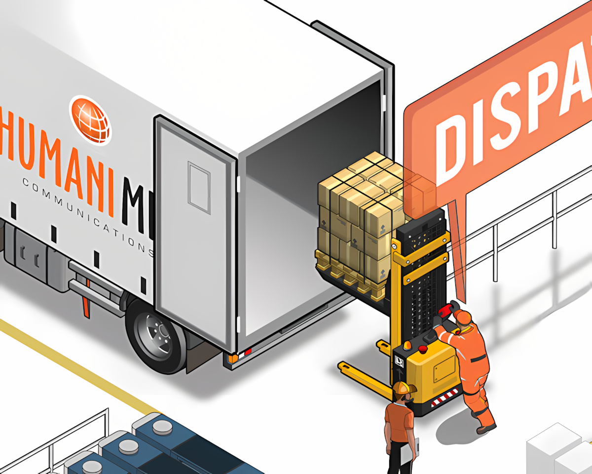
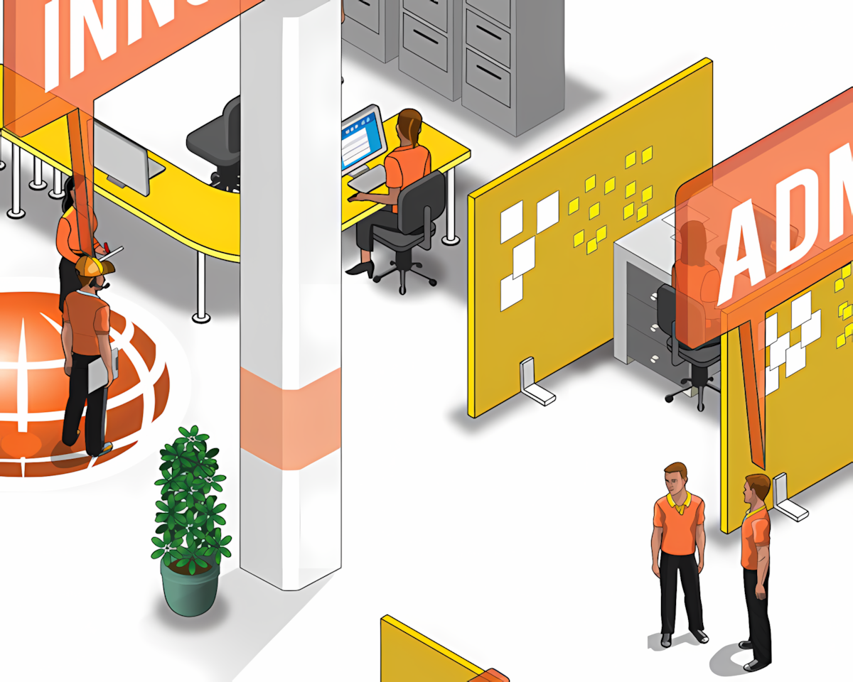
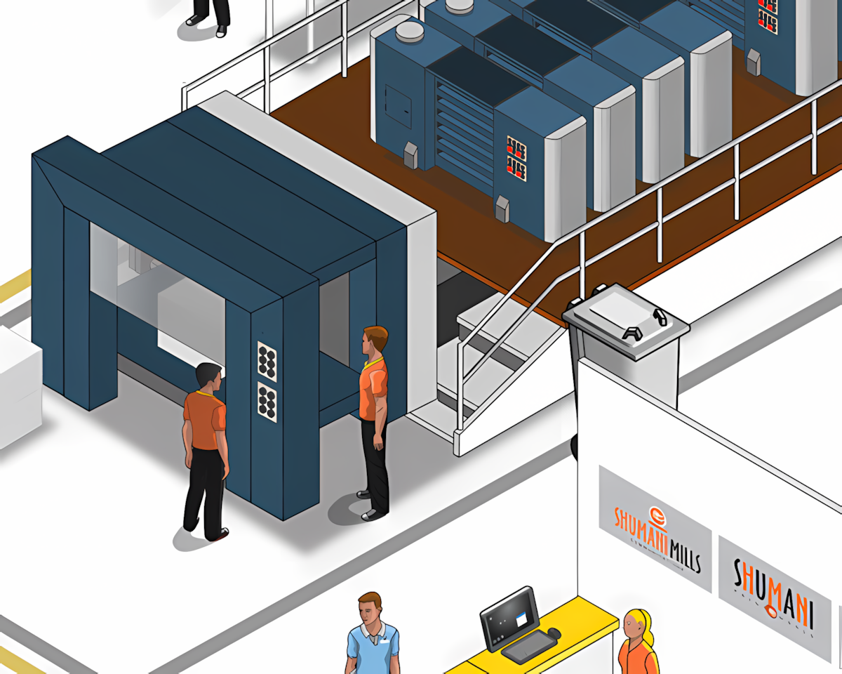
Nathan and Brad at Shumani Mills — a professional print studio — were producing a high-quality glossy brochure for one of their clients. They needed a single, comprehensive illustration that could carry readers through every major stage of the commercial printing process, from pre-press through to the finished product.
The Approach
I chose an isometric perspective — the right call for a process diagram, since it lets you show machinery, workflow, and spatial relationships clearly without the distortion of true perspective. The illustration was built up in Flash and Illustrator, working stage by stage through the printing workflow. Lots of fiddly detail, precisely placed.
The Outcome
A detailed, multi-panel isometric illustration depicting all the key stages in a commercial print run — delivered print-ready for reproduction in the finished brochure. The complexity of the subject matter is made approachable through clear visual flow and consistent isometric logic across every panel.
1
Large-format Illustration
Every major stage in the commercial printing process, rendered in a consistent isometric style.
Isometric
Illustration Style
Precise isometric technique built in Flash and Illustrator — technical accuracy paired with visual clarity.
Ready for Press
Artwork resolved and delivered at spec for high-quality reproduction in a glossy printed brochure.
Back to top
Homeloan Assist